I have worked on numerous national and international projects with various clients. This includes logo designs, logotypes, menus, branding,and packaging designs. Please navigate to the main menu for more projects, short animated films, online resume, workshops, talks and blog posts.
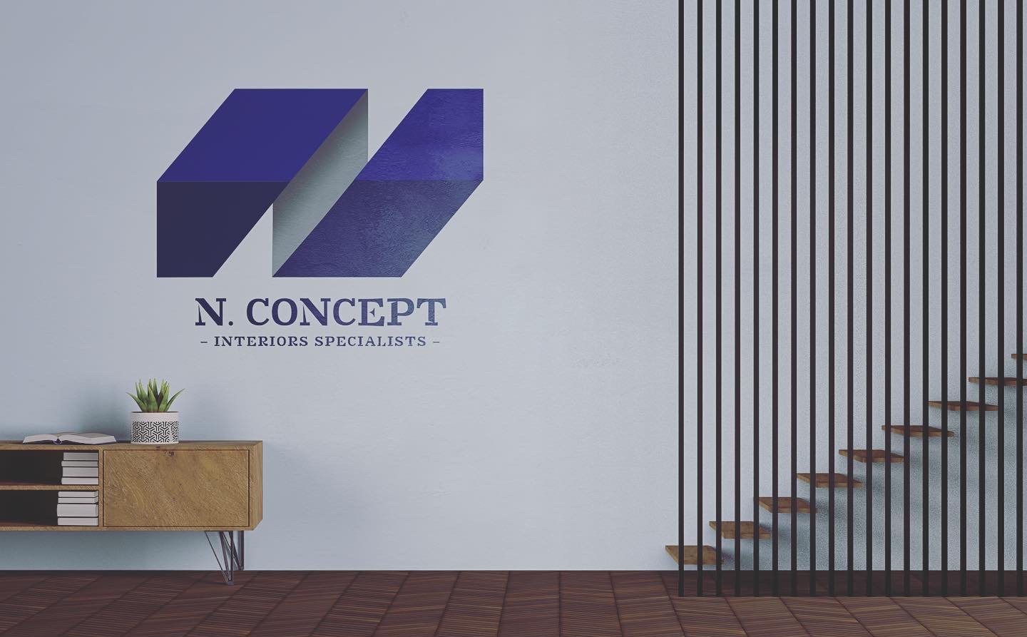
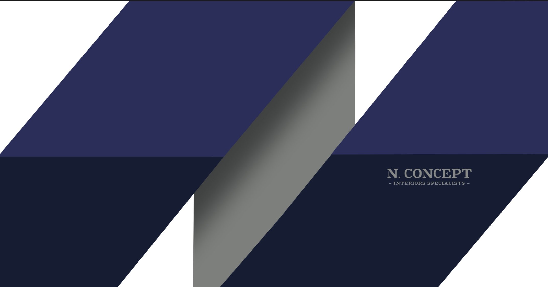
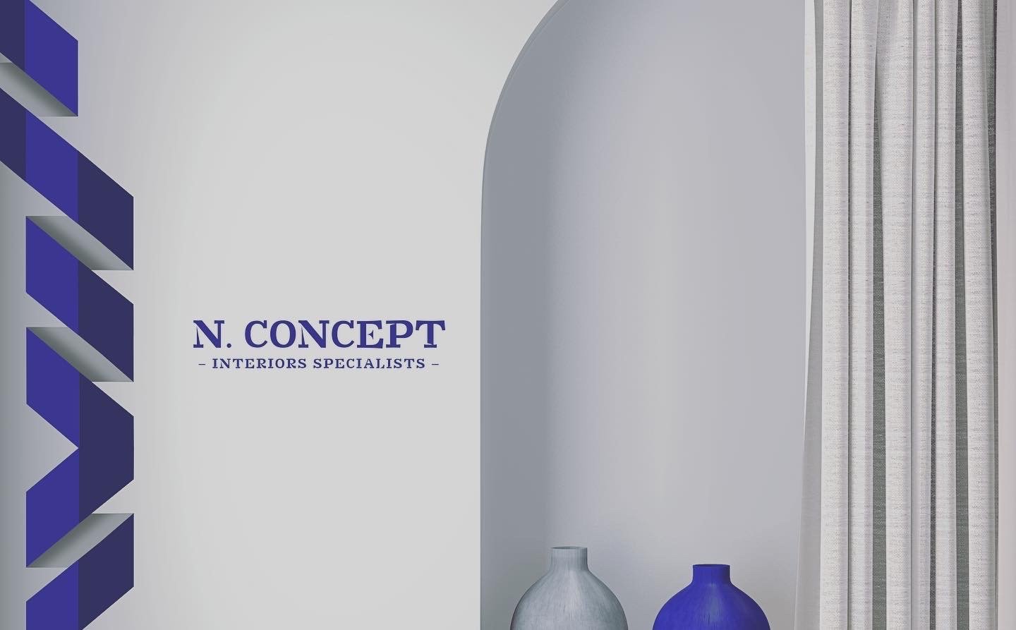
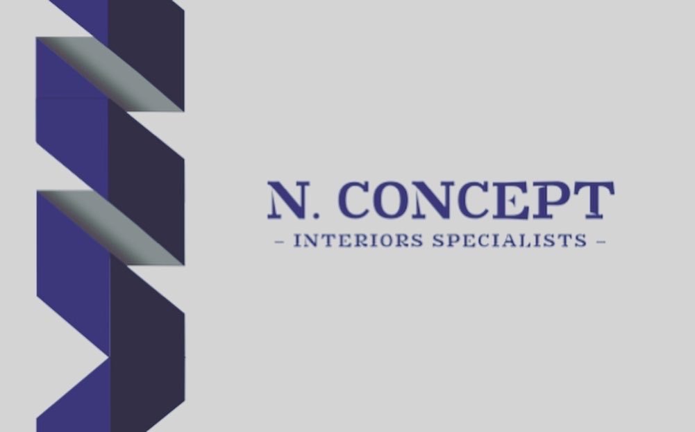
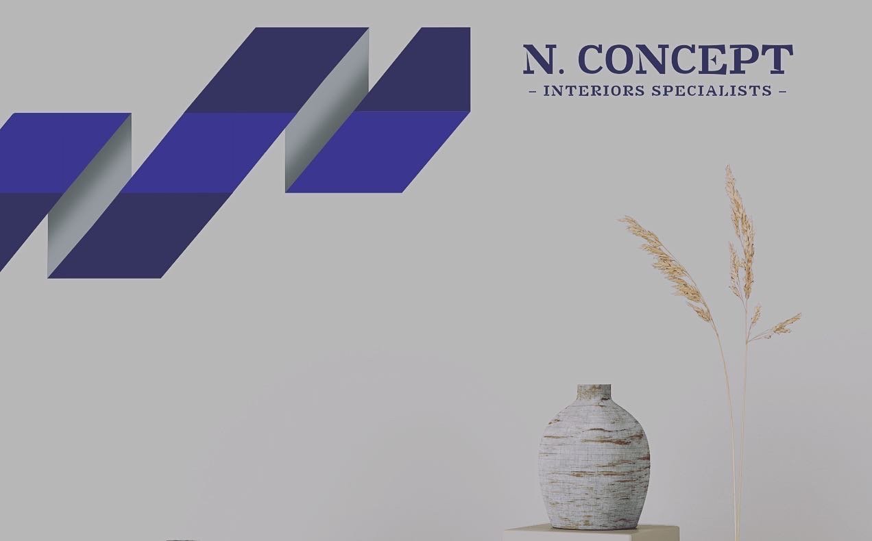
N. Concept, 2020, Kuwait
A private interior design agency that is based in the heart of Kuwait. Founded by a local Interior Designer.
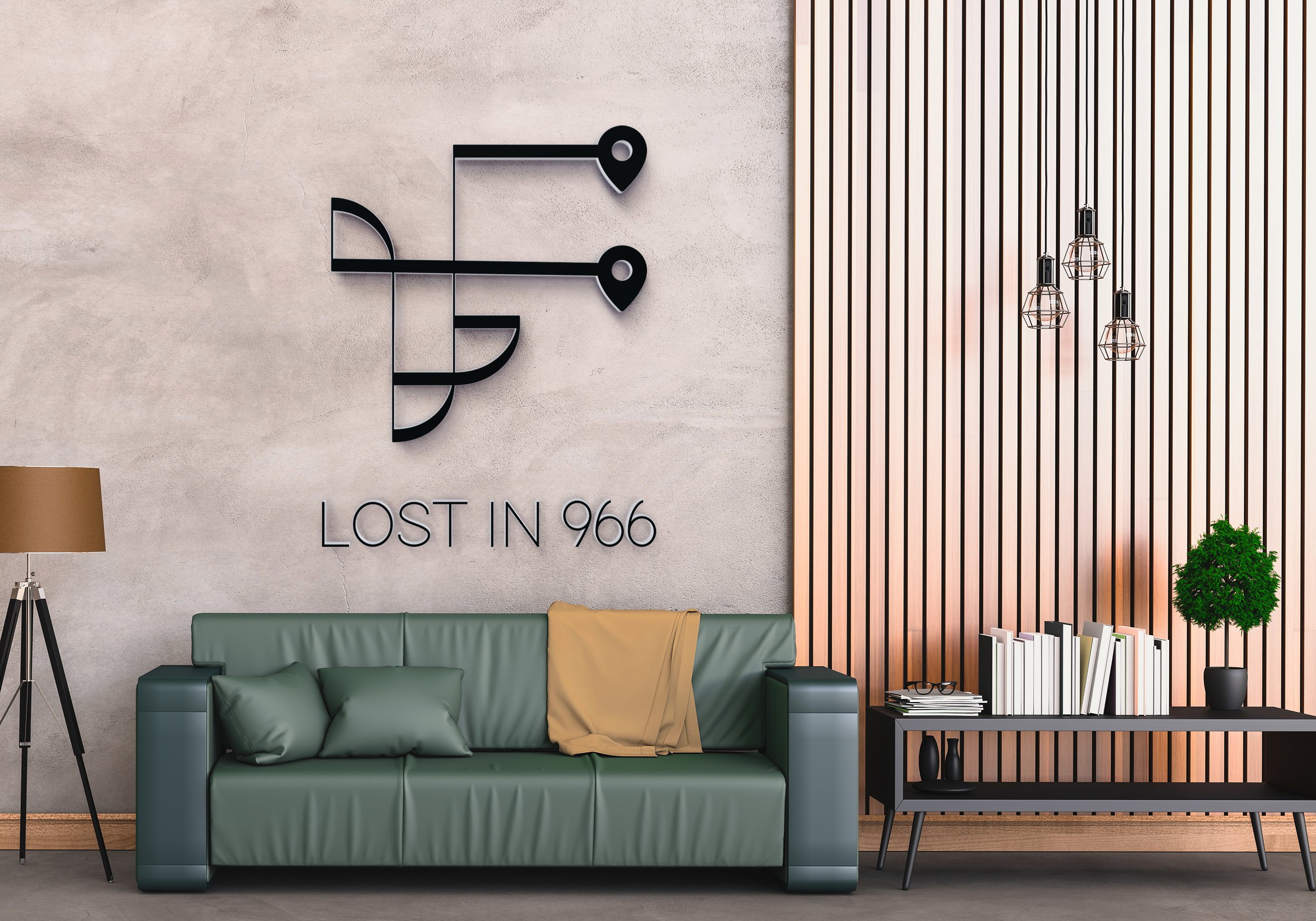
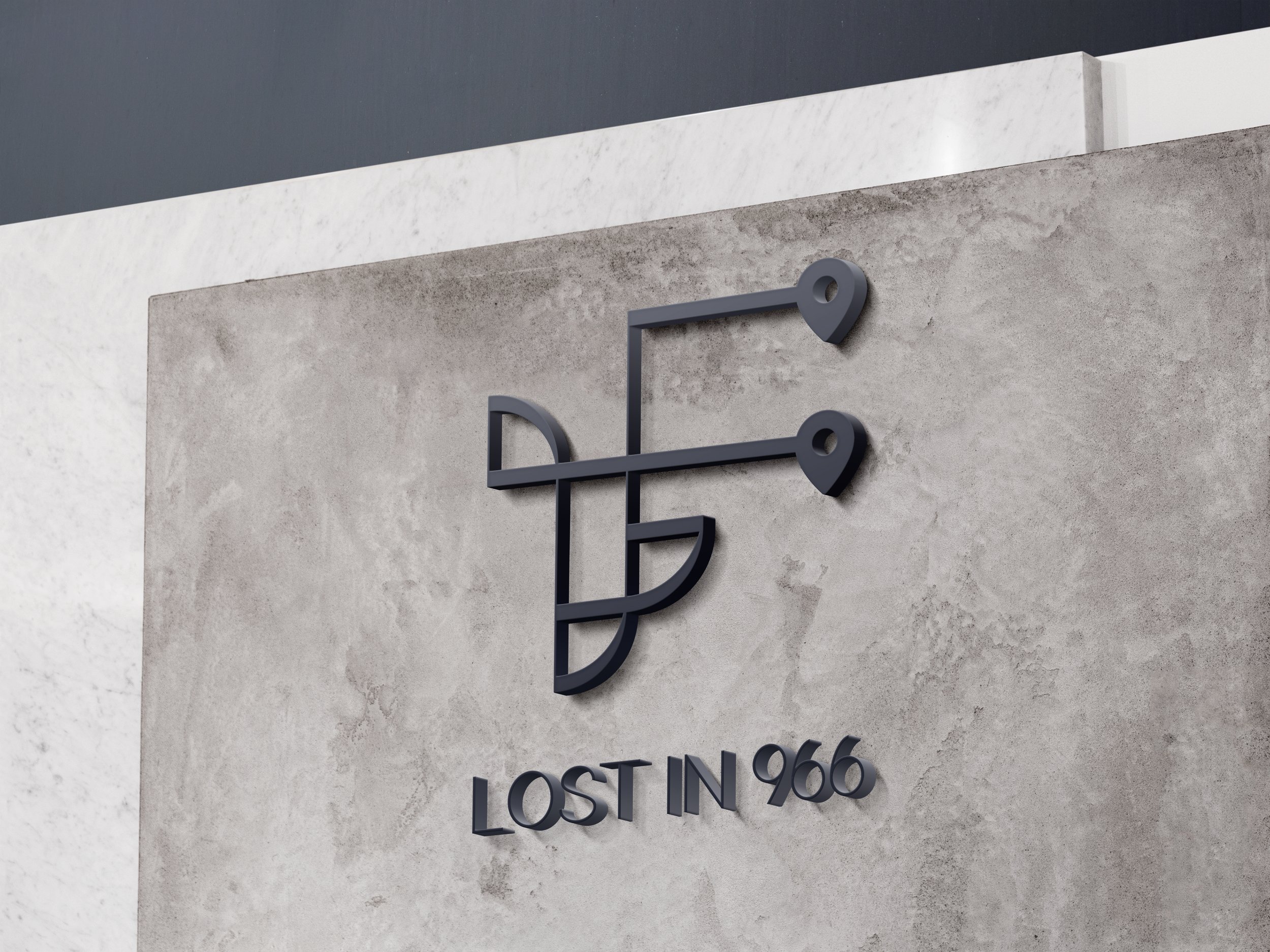
Lost in 966, 2020, Saudi Arabia
A private business founded by two Saudi women partners. An architecture & interior design agency that is based in Saudi Arabia.
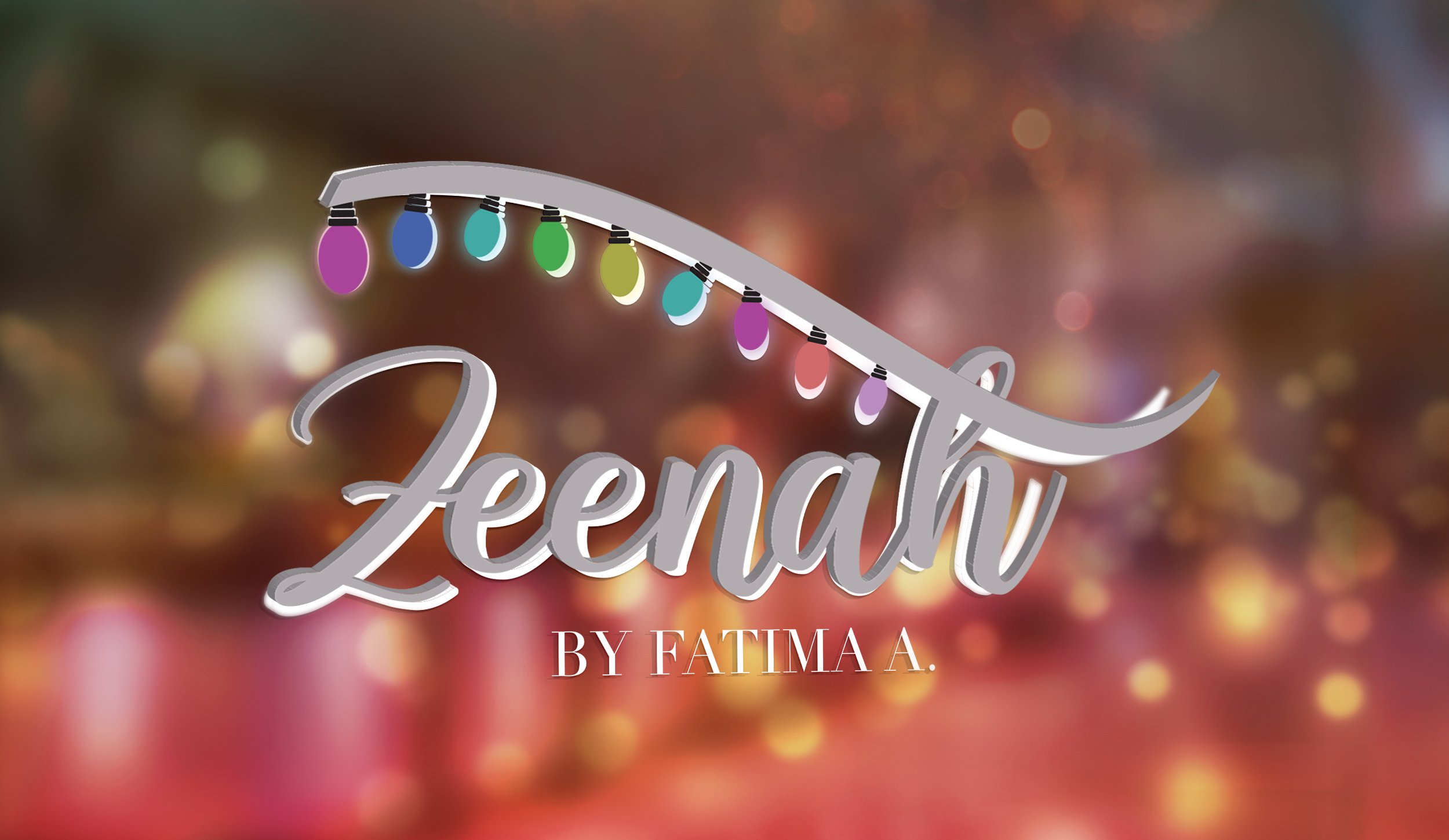
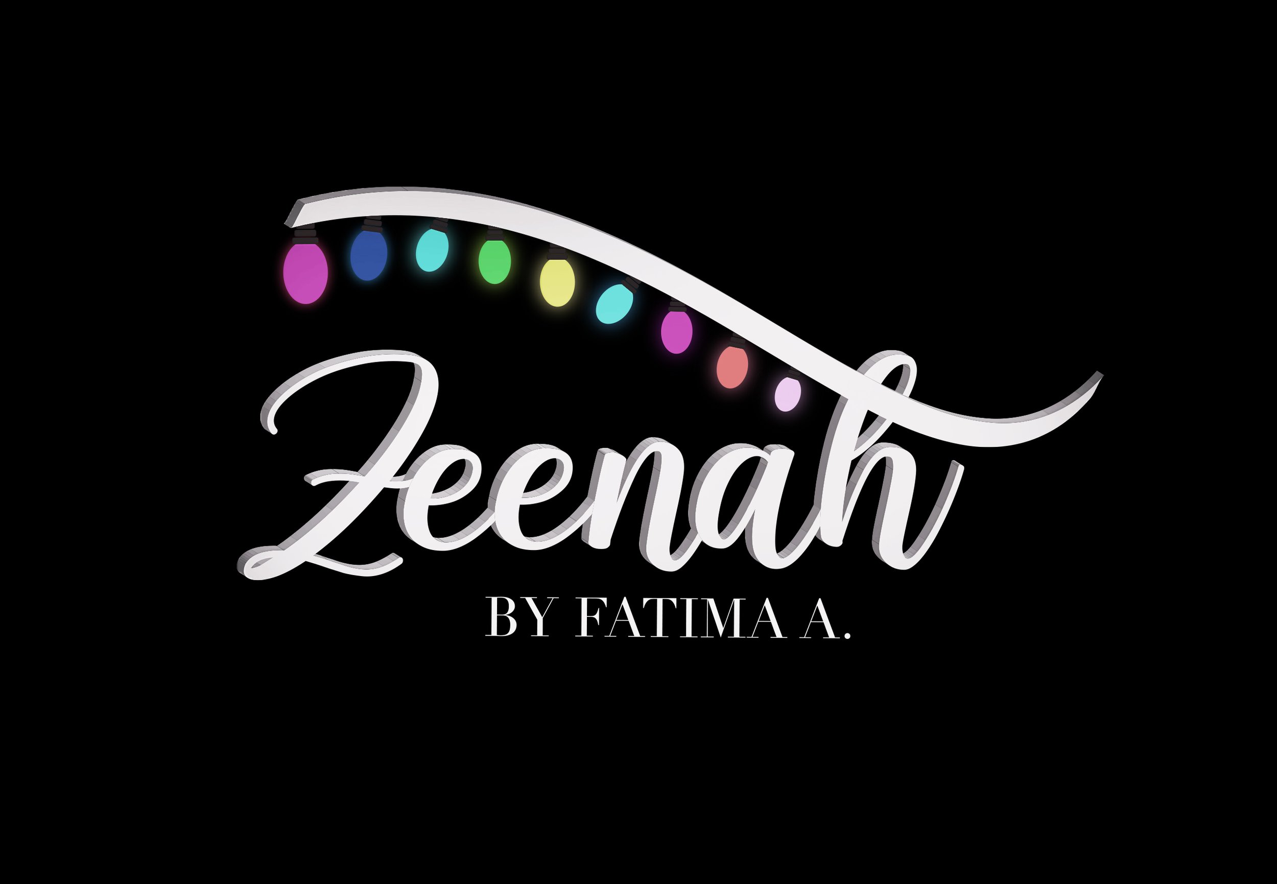
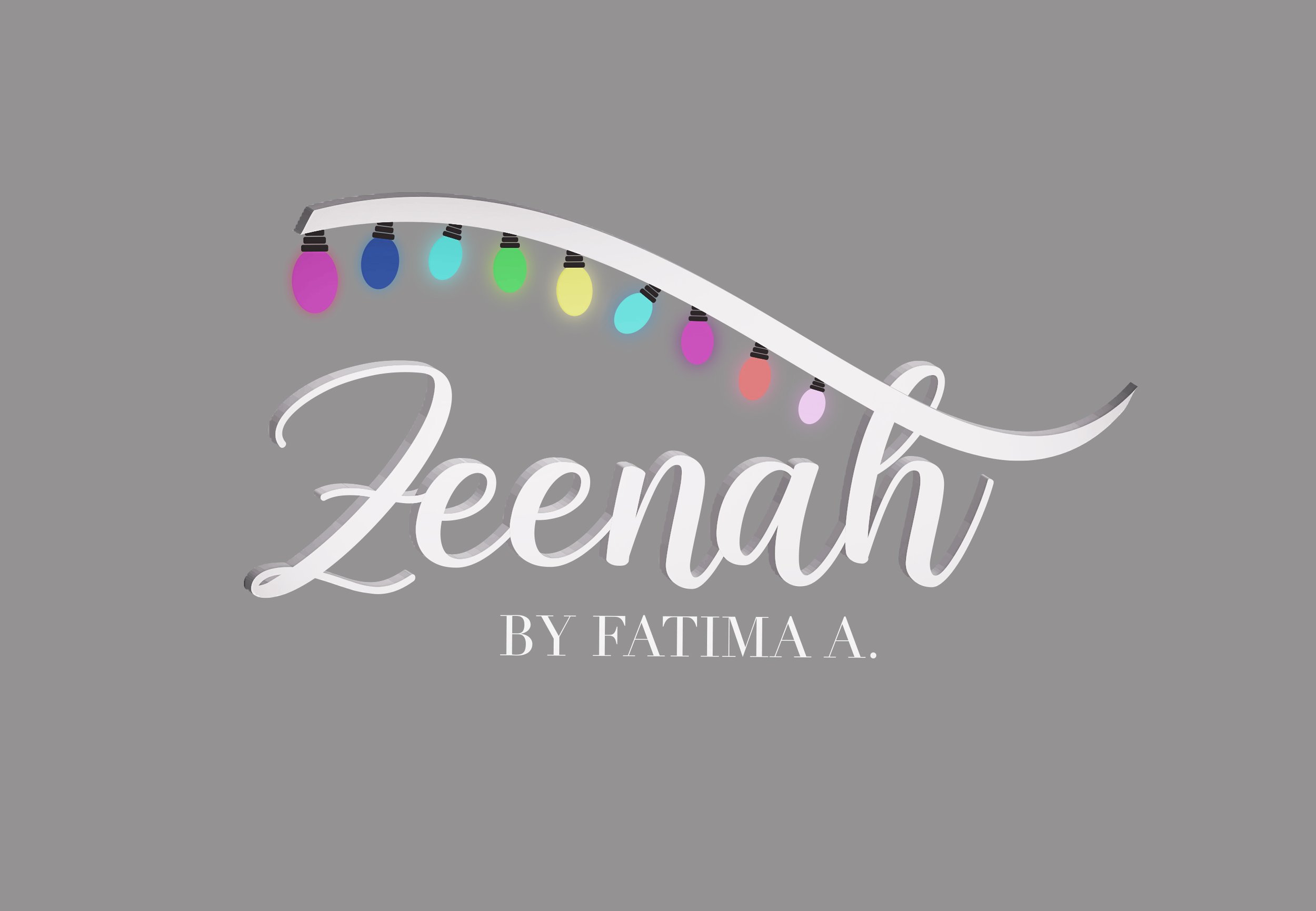
Zeenah, 2020, KUWAIT
Logotype for Zeenah, owned by Wedding & Event Planner Fatima A. This is a newly established event planning company Zeenah is based in Kuwait.
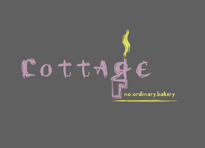
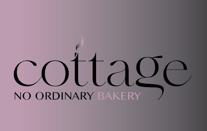
COTTAGE BAKERY, 2020, KUWAIT
Rebranding of Cottage Bakery
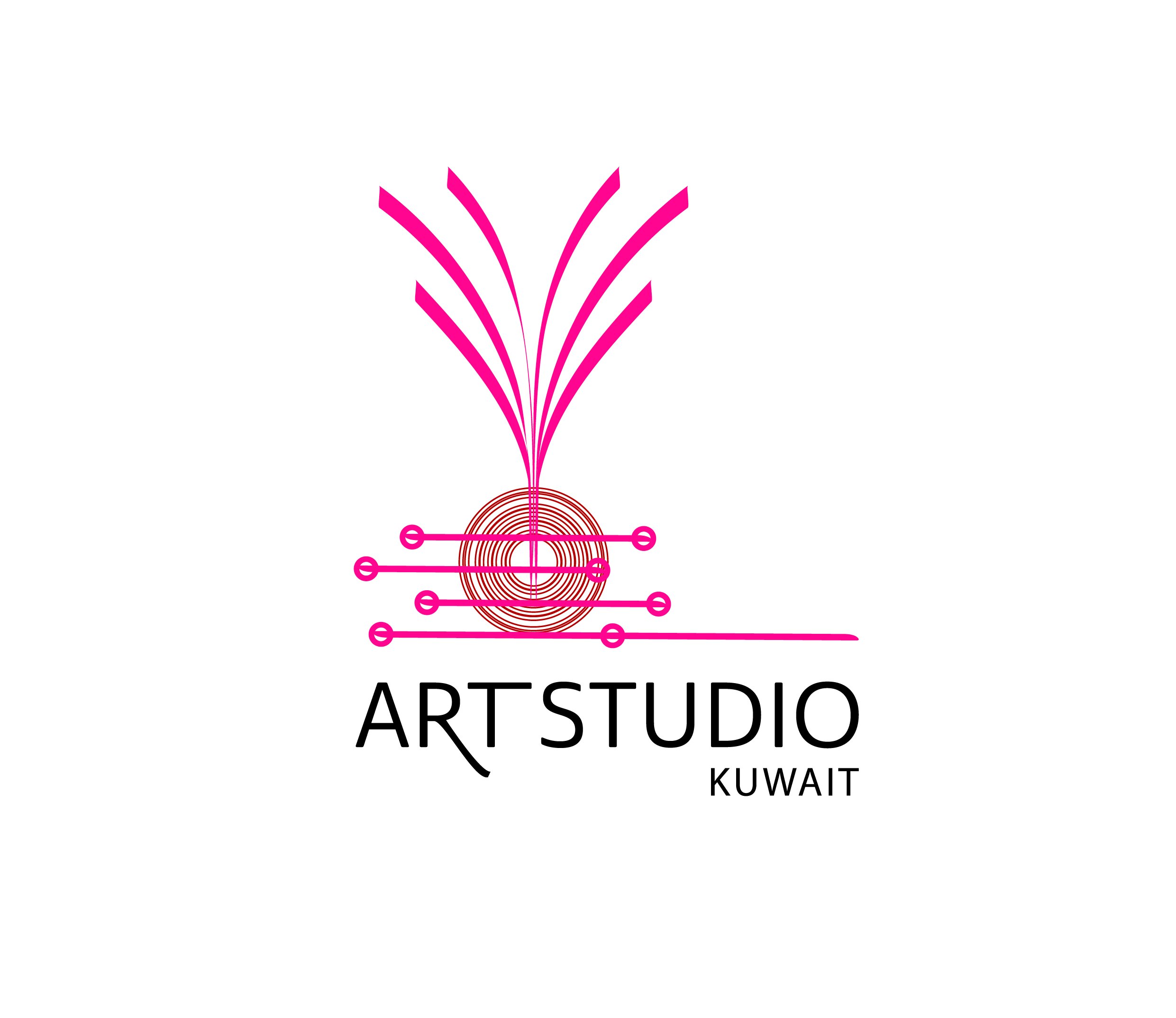
ART STUDIO, 2019, KUWAIT
72 hours: is the duration of a communal interactive creativity workshop event. While artists worked on various projects, observation took place from distance to learn and understand the content given. This allowed space for a cross-disciplinary approach - observing typographic movement of the Arabic & English letters used by participants through human expression, mood and rhythm. The purpose is to pick insights, get inspired and develop the final logo design for the overall event and the birth of Art Studio - based on the use of the opening of the first set of workshops’ concepts, techniques, and tools.
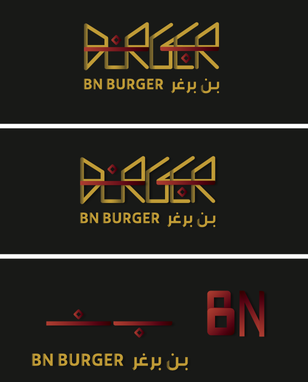
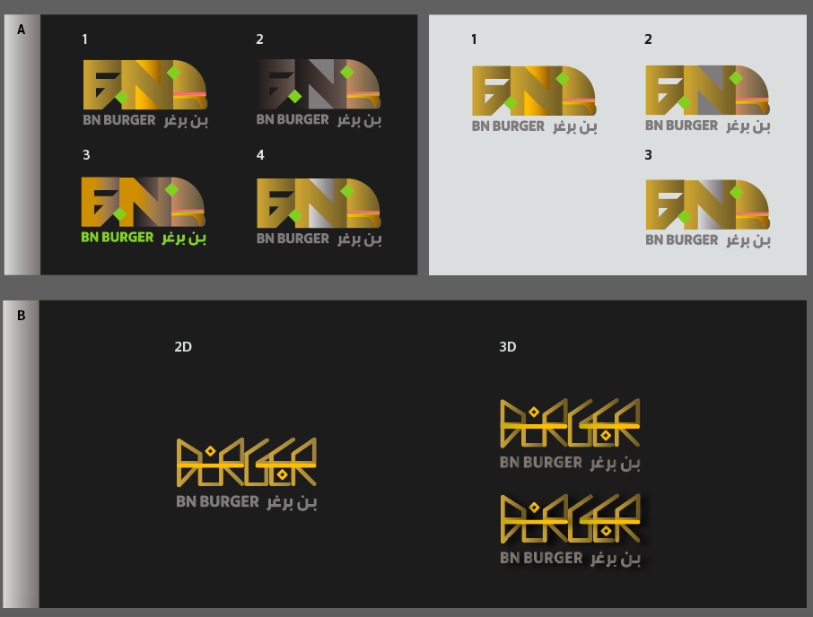
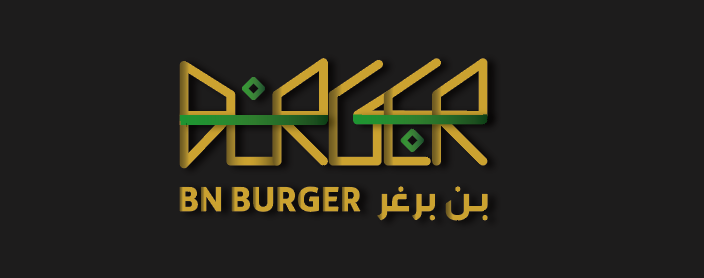
BN BURGER, 2019, KUWAIT
Working with butchers to meat wholesalers in the region with knowledge of different food ingredients, BN BURGER is a local Kuwaiti project that offers its ready-to-grill foods all enclosed in an inspiring package for-to-go services. The client approached me to create a bilingual (Arabic-English) logotype that focuses on food cultured symbolism.
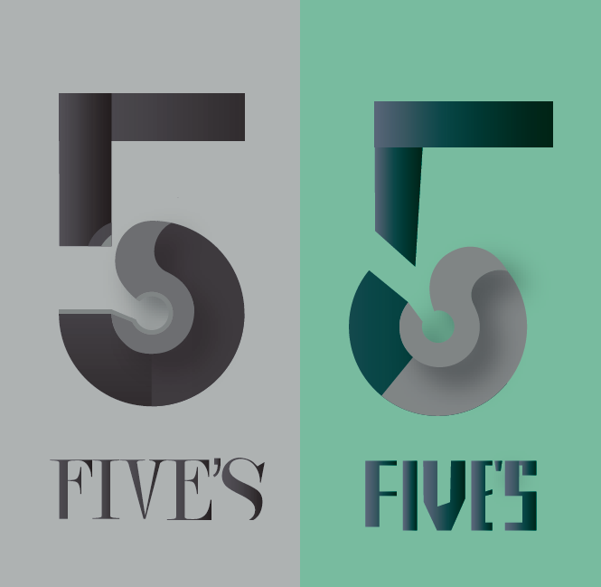
FIVE'S, 2018, KUWAIT
Sample logo (right) and Final logo (left) designed for Five’s, a local Kuwaiti department store. The logo was rebranded; the client wanted a 3D modern logo that compliments the new company’s futuristic vision. The design of the logo aims to balance between the different shades, depth and contrast of the vertical and horizontal elements. This is created to activate the negative space and render the overall shape of the number.
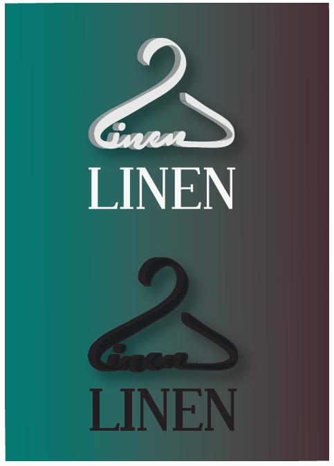
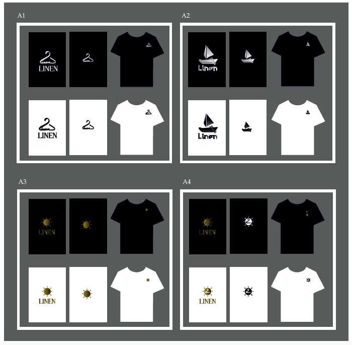
LINEN, 2018, KUWAIT
Various logo concepts for Linen, a local Kuwaiti brand. Linen provides essential clothing for summer use. The client wanted a logo design that reflects on its summer theme, a logo that could be infused with a symbol that either represents clothing tools and equipment or summer activities.
O+ Burgers, 2018, KUWAIT
O+ is a local Kuwaiti burger restaurant. The client uses healthy organic ingredients and hence wanted an unusual store nam and logo design. The name was chosen according to the majority’s blood type in Kuwait. Letter ‘O’ represents the round shape of a burger while the plus sign represents the additional sauce options - since the restaurant also specializes in a variety of burger sauces.

TITU OF LONDON, 2018, UK
A concept logo for TITU London, a new modern Japanese-Bar restaurant located in the heart of London. It offers a selection of mains and desserts, with handmade gyozas, colourful Asian-inspired salads and snacks, as well as curated breakfast options.

REEF, 2018, KUWAIT
Reef is a Kuwaiti - Arabic animation visual storytelling instagram account. It includes short 30-40 seconds animation segments. The 3D characters have been created in accordance with real life powerful Arab women personalities. Reef celebrates the dynamic role of Arab women and reflects on most Arab women with serious, strong, friendly, funny and lively characters. More on Reef is found on instagram: Account: @ReefHere

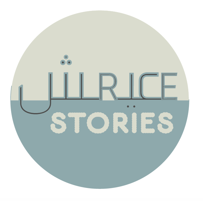
RICE STORIES, 2017, KUWAIT
A bilingual logo design created for Rice Stories, a local Kuwaiti rice specialty home business. The logo design merges the English and Arabic words for “RICE”. Both the Arabic and English characters share the same x-height. The name was chosen according to the different stories initiated in the process of cooking special rice dishes!
TOILET SIGNS, 2017, KUWAIT
A concept logo for TITU London, a new modern Japanese-Bar restaurant located in the heart of London. It offers a selection of mains and desserts, with handmade gyozas, colourful Asian-inspired salads and snacks, as well as curated breakfast options.

BOOK SERIES, 2017, LONDON
The book series take readers on a different pedagogical journey where they will learn simplified Arabic through a new pedagogic method that has not been taught before. This is through the use of typefaces and graphic communication to facilitate the memorization of letters and language. I have developed new ways and artistic methods that aim to help speed up Arabic learning. As a result, I have developed pedagogical tools via reassigning several 20th-century typefaces.

FLOURISH, 2017, KUWAIT
A 3D logo design created for Flourish, a local Kuwaiti flower shop.

LEAN START, 2017, WORLDWIDE
A 3D concept-based logo design created for Lean Start, a private international entrepreneur company.

KHATT OF LDN, 2017, LONDON
This is a logotype created for Khatt, a newly established annual art and design event located in the heart of London, founded by myself. The logotype stems from an Arabic type design project created in 2016. The project involved the fusion of type, fashion textiles (fabrics) and power of reflective opacity and light. The idea was to test how the shapes of Arabic characters react to fashion material and space.

RHSH,RHSH 2017, KUWAIT
An Arabic logotype created for a local Kuwaiti bakery, Rahash-Rahash. The project involved branding, from the creation of corporate identity of the shop to the packaging design.

MOKA'AB TYPEFACE, 2016, KUWAIT
Moka’ab is an Arabic typeface influenced by Kufic style and geometry. The typeface is created to facilitate basic Arabic learning to young children, Arab and non-Arab learners with no or less language skills. The typeface is divided into transitional phases to introduce and help learners visualize the letter shapes periodically.

GMASH, 2016, KUWAIT
Logo design created for Gmash (meaning fabric). Gmash is a private fashion business founded by a local fashion designer. The logo design was influenced by Middle Eastern geometric patterns and essential fashion equipment.

TYPE CELEBRATION, 2016, KUWAIT
Type Celebrations of a Sheep is an educational Arabic typography project created to celebrate expressive type in various environments. The aim of the project is to challenge the complexity of Arabic characters when exposed to the world’s multi-cultural celebrations. The aim is to test the flexibility of the characters when creating typographic imagery to represent cultural symbols.
